2009-07-24, 04:59 AM
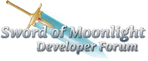
Ok, I just whipped up something really quick before I went to bed. I did basically the Trismegistus logo design (with the capital letters the Chaucher font, and the small letters the Black Knight font.)
Rather than a dull, ordinary drop shadow, I did a 100 pixel motion blur on a different layer. That's what came to mind when you said "ghostly".
I'm not expecting you to fall head over heals with this one, since its just slapped together. However, with some feedback, I think I could improve upon it. Questions, comments, snide remarks and every form of criticism welcomed.
![[Image: somlogo.gif]](https://www.swordofmoonlight.com/somlogo.gif)


![[Image: banner.gif]](https://www.orationem.com/banner.gif)